MockupUI Reference Manual
Contents
User interface
UI widgets
Graphic widgets
Working with widgets
Annotations
Visual styles
Templates
Exporting
Projects
Setup
Help
Common UI widgets
|
|
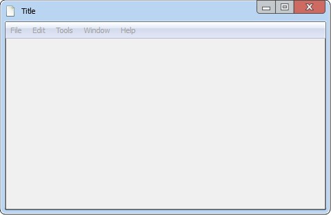
Window
Window widget with control buttons and a menu bar.
|  |
Menu
Menu widget to use with menu bars or as pop-ups. Items: Sets the items of the menu, one item per line. You can use one of the following prefixes to customize menu items:
| 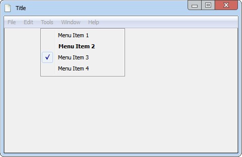 Example: |
Toolbar
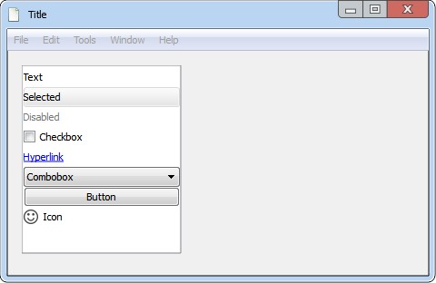
Toolbar widget with control buttons. Use the Items parameter to set the items in the tool bar, one line of text per item. Items can be text lines, comboboxes, checkboxes, hyperlinks and buttons or a mix of them. To insert a separator add a blank line. The items can be customized individually by prefixing lines with one of the following characters:
| 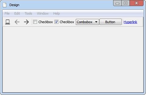 Example: |
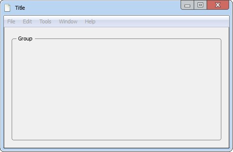
Group
Grouping frame with a title.
|  |
Tab
Stack of tabbed panes.
| 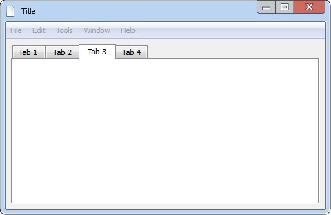 Example: |
Button
Standard command button.
| 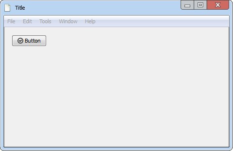 Example: |
Checkbox
Check box with a text label.
|  |
Radio
Radio button with a text label.
| 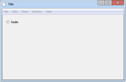 |
Slider
Horizontal slider widget.
| 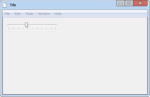 |
Label
Static text on single or multiple lines.
|  |
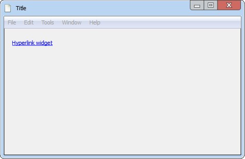
Hyperlink
Hyperlink widget.
|  |
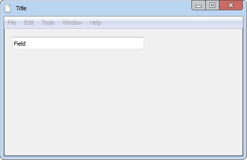
Field
One-line text editor.
|  |
Spin box
Spin box widget.
|  |
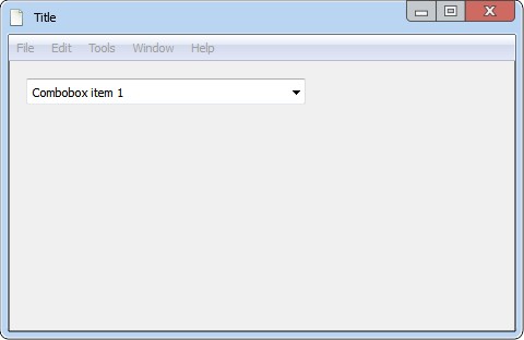
Combo box
Drop down list.
|  |
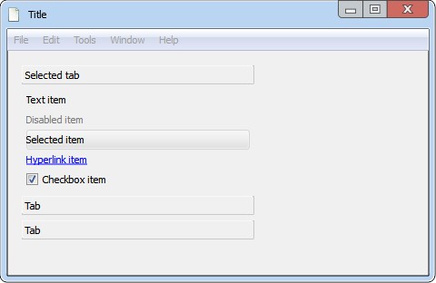
List
List of selectable items. Use the Items parameter to add items to the list, one line of text per item. Items can be text lines, comboboxes, checkboxes, hyperlinks and buttons or a mix of them. The items can be customized individually by prefixing lines with one of the following characters:
|  Example: |
Tool box
Column of collapsible items. Use the Items parameter to set the tabs and tool items in the tool box, one line of text per item.
To expand a tab add a Tool items can be customized individually by using the following prefixes:
|  Example: |
Text area
Rich text editor with custom font, size, color and alignment.
| 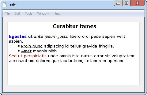 |
Dial
Rounded range control similar to a potentiometer.
| 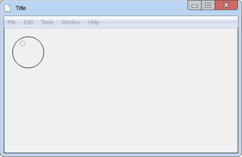 |
Progress bar
Horizontal progress bar.
| 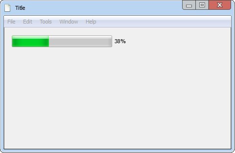 |
Calendar
Calendar widget. You can select the day in the calendar in the Widget properties panel. | 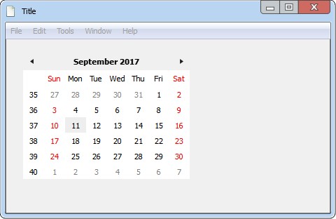 |