MockupUI Reference Manual
Contents
User interface
UI widgets
Graphic widgets
Working with widgets
Annotations
Visual styles
Templates
Exporting
Projects
Setup
Help
Design area
This is where you can visualize and edit the contents of the currently selected design.
It is also where you can insert, visualize and edit widgets.
Scrolling and zooming
If the design does not fit into the Viewer window you can scroll the view
to see a different part of it. Hold down the Ctrl key and the Right
Mouse Button and drag the image by moving the mouse.

- Zooming in and out
Spinning the Mouse Wheel with the Ctrl key pressed will vary the zoom. You can also use
the toolbar zoom spinbox to enter the desired zoom level or the Zoom In and Zoom Out buttons.
- Zoom to Fit
The Zoom to Fit button will scale up or down the image to the size of the viewer window.
- Original Size
By selecting the Original Size button, the viewer will display the widgets unchanged.
- Panning
Press Ctrl + Hold Right Button + Mouse Move.
If the image does not fit into the viewer window you can pan the view
to see or zoom different areas of the image. Hold down the Ctrl key and the Right
Mouse Button and drag the image by moving the mouse.
Snap to grid

When you draw, resize or move a widget, you can let MockupUI automatically align the object to the nearest grid line. To enable grid snapping select the desired size of the grid from the drop down list in the toolbar. Snap-to capability can be turned off by selecting None.
By default an 8 pixel grid is selected.
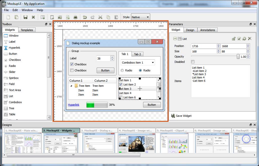
Editing widgets inside the design area
Once a widget is added to a design, it becomes visible in the design area inside a rectangular box that can be moved or resized to the desired dimensions. The content of the widget will be updated when the widget properties are changed.
Editing using the mouse
Selecting. Press the
Mouse Left Buttoninside the widget's bounding box to select it. A selected widget will display a rectangular box around it. To select multiple objects at once keep theCtrlbutton pressed whileClickingeach object to select or draw a rectangle around the objects to select with theLeft Buttonpressed.Moving. Hold the
Mouse Left Buttoninside the widget and move it to the desired position. The position of a widget is relative to the center of the widget and to the top-left corner of the canvas. You can use the horizontal and vertical ruler as a guide.Resizing. Hold
Mouse Left Buttonover a border and drag it to resize the widget.
When the mouse hovers over the borders or the corners of a widget you will notice that the mouse pointer changes into an arrow. This tells you that a resize action is available.
Dragging a border will resize one dimension of the widget while dragging the corner will change the height and width of the widget.
If you wish to preserve the current aspect ratio of the widget, hold the Ctrl key while
dragging.
Editing image widgets
For image widgets, the content of the image can also be edited. The image can be scaled, rotated and translated. Note that transforming the content of an image widget refers to the image and not the widget's sizing box. If you want to change the dimensions of the widgets use the Size parameter.
Scaling. Hold
Shift+Mouse Wheel. Scales the image up or down (from 0 to 10 times).Rotating. Hold
Shift+Ctrl+Mouse Wheel. Changes the angle of rotation around the center of the image.Panning. Hold
Shift+Mouse Move. Offsets the image horizontaly and verticaly from the center of the widget.
Widget's popup menu
Right click on a widget to open the widget popup menu. The available widget actions are:
Show/Hide. Hiding a widget will remove it from the design area. If you want to make it visible it you will have to do this from the Design panel.
Reset to Default. This action will reset the widget's parameters (such as size and position) to their initial values.
Lock. This action will make the widget unselectable and non-editable in the viewer.
Cut
Ctrl+X. Remove the widget from the image and put it onto the clipboard.Copy
Ctrl+C. Put a copy of the widget onto the clipboard. The copy will preserve all the parameter values of the original.Paste
Ctrl+V. Paste the widget found on the clipboard into the currently selected image. The pasted widget will have the same position and dimensions as the original.Duplicate
Ctrl+D. Create a copy of the widget and paste it into the currently selected image.Rename
F2. Change the name of the widget.Delete
Del. Remove a widget from the design.Ordering. Widgets are rendered in the order they have been added, meaning that the last added will overlap the previous. The order can be changed by using the
Bring to Front(PageUpkey) orSend to Back(PageDownkey) on the selected widget. You can also change the order of the widgets by dragging the effect up or down inside the Design tab in the Parameters panel.