MockupUI Reference Manual
Contents
User interface
UI widgets
Graphic widgets
Working with widgets
Annotations
Visual styles
Templates
Exporting
Projects
Setup
Help
Parameters Panel
The Parameters panel is where you adjust the properties of the widgets. The parameters panel has three tabs: Widget, Design and Annotations.
The Parameters panel displays the parameters for the currently selected design. Clicking on a design thumbnail in the design browser will update the parameters panel.
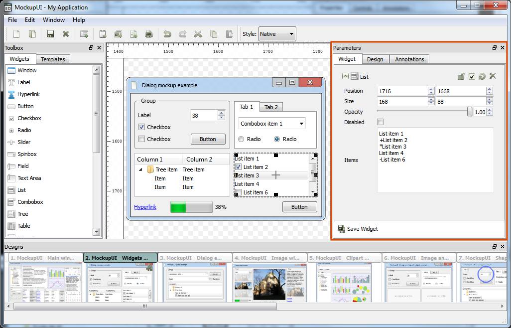
Widget tab
The Widget tab shows the parameter editor of the currently selected widget. It allows you to change the widget's geometry, content and formatting.
Changing parameter values
Changing the value of a parameter will update the widget inside the design area.
The parameter controls can be of one of the following types:
Slider: A slider allows you to decrease or increase the value by moving the slider's handle to left or to right, respectively.
Numerical value: Allows you to either type in a number followed by Enter or to increase/decrease the existing value using the up and down arrows.
Text value: Allows you enter a simple text with no formatting.
Text editor: Allows you type or paste formatted text (see Text widget for more details).
Checkbox: Specifies a yes / no value.
Choice list: Allows you select a value from a list.
Color control: Allows you select a color either as a Red, Green, Blue triplet or using the Hue, Saturation, Value dial (click the color button if you want to show/hide the HSV color dial). In some widgets the color control also has an eye dropper tool that allows you to pick a color from the working area of the design area.
Position: A position control allows you to enter absolute X and Y coordinates in pixels.
Size: A size control has two values, Width and Height that are expressed in pixels.
File or folder: Allows you to specify a file path. By clicking the
...button, a File Dialog will open allowing you to browse your computer disks and select a file or folder.Page Link: Allows you to link the current widget to another page of the current project. When generating an interactive presentation, the widget will become clickable and will allow you to navigate through the pages of the document.
Design tab
The Design tab allows you to:
- Hide, lock, reset or remove a widget from a design
- Manage the z-order of the widgets (moving to front or to back).
- Select a widget by clicking on its header in the Design tab.
Refer to the Working with widgets section for details.
Annotations tab
The annotations tab allows you to add descriptions and notes to your designs. Refer to the Annotations section to learn more.