MockupUI Reference Manual
Contents
User interface
UI widgets
Graphic widgets
Working with widgets
Annotations
Visual styles
Templates
Exporting
Projects
Setup
Help
Table widget
Draws a UI table widget with columns and row header.
Fill tables with data in a CSV-like format.
Add buttons, comboboxes, checkboxes, icons and hyperlinks to cells or entire columns.
Tick/untick column or cell checkboxes individually.
Highlight or disable columns or individual table cells.
Adding table data
A row is defined as a list of comma separated values, one value per item. The first row defines the header of the table. Use the Items parameter to set the cells of the table, one line of text per table row.
Items can be text, numbers, comboboxes, checkboxes, hyperlinks and buttons or a mix of them. You can set the type of a column or individual items by prefixing the header or an item with one of the following characters:
* Selected: Highlights the item by adding a different color background.
# Disabled: Renders the item or column as greyed.
& Hyperlink: Renders the item or the column as an underlined hyperlink.
^ Combobox: Adds a combobox widget to the cell or column.
- Checkbox unticked: Adds an unticked checkbox and a label.
+ Checkbox ticked: Adds a ticked checkbox and a label.
[text] Button: Adds a button with a text caption.
@ Icon: Adds an icon and a text. The syntax for adding an icon and a text is "@icon:Text". The list of available icons can be found in the Shapes tab of the tool box.
Examples
Example 1 - Column with checkboxes
Column 1,+Checkboxes
Item     1,Check 1
Item     2,-Check 2
Item     3,-Check 3
Example 2 - Column with hyperlinks
Column 1,&Hyperlinks
Item     2,Link 1
Item     3,Link 2
Item     4,#Disabled link
Item     5,+Checkbox link
Example 3 - Disabled items
Column 1,Column 2
Item     1,#Disabled item 1
Item     2,Disabled item 2
Item     3,#Disabled item 3
Example 4- Buttons
Column 1,Buttons
Item     1,[Button 1]
Item     2,[Button 2]
Item     3,Text item
Example 5 - Mixed item types
Column 1,Column 2
Text item ,[Button 1]
&Hyperlink,+Checked
^Combobox ,#-Unchecked disabled
[Button],#[Button disabled]
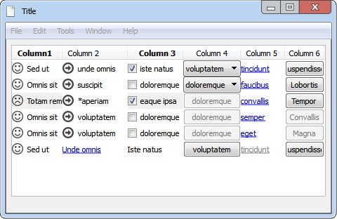
Example 6 - Icons
Column1        ,&Column 2           ,  Column 3,  Column 4,&Column 5             ,[Column 6]
@smile:Sed ut,@right29:unde omnis,+iste natus,^voluptatem,tincidunt,Suspendisse
@smile:Omnis sit,@right29:suscipit,-doloremque,^doloremque,faucibus,Lobortis
*@frown:Totam rem,@right29:*aperiam,*+eaque ipsa,#[doloremque],convallis,Tempor
@smile:Omnis sit,@right29:voluptatem,-doloremque,#[doloremque],semper,#Convallis
@smile:Omnis sit,@right29:voluptatem,-doloremque,#[doloremque],eget,#Magna
@smile:Sed ut,Unde omnis,Iste natus,[voluptatem],#&tincidunt,Suspendisse