MockupUI Reference Manual
Contents
User interface
UI widgets
Graphic widgets
Working with widgets
Annotations
Visual styles
Templates
Exporting
Projects
Setup
Help
Graphic widgets
In addition to UI widgets, MockupUI offers a number of graphic widgets that you can add to your mockups. They can be moved and resized inside the design area and their parameters can be adjusted in the widget properties tab.
Image widget: Displays an image loaded from a file.
Clipart widget: Displays a vector loaded from an SVG file.
Graphic text: Draws formatted graphic text.
Shape widgets: Basic shapes, arrows, bubbles and icons.
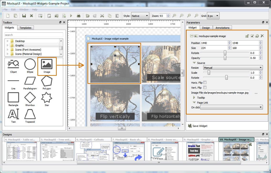
Image widget
Insert images into your mockup designs. An image can be edited inside the design area or by changing its properties in the parameters panel.
Features
Scale, flip, rotate and change opacity.
Manual or automatic cropping and sizing: fit, fill or stretch.
Supported formats: PNG, JPG, PPM, TIFF, BMP.
Widget transformations
Position: The center position of the image in pixels.
Size: The widget's dimensions in pixels.
Rotate: Rotate the widget around its center.
Opacity: Opacity of the widget from 0 to 100%.
Image resizing
Automatically scales the image up or down in order to fit inside the widget's bounding box. Resizing methods:
Manual: Use the Scale parameter to specify a custom scale.
Fit: The image is automatically scaled to fit both the widget's dimensions. The aspect ratio is preserved.
Stretch: The image is automatically stretched to fit both the widget's dimensions. The aspect ratio is not preserved.
Fill: The image is automatically scaled and cropped to fill the widget's rectangle. The aspect ratio is preserved.
Scale: Scales the image up or down (from 0 to 10 times). Scaling refers to the image and not the widget's bounding box. If you want to change the dimensions of the widgets use the Size parameter or resize feature in the design area. This parameter is only active when Manual resizing is selected.
Image properties
Rotate: Rotate the source image around its center.
Offset: The position of the image inside the widget's bounding box.
Vert. Flip: Flip the image vertically.
Horiz. Flip: Flip the image horizontally.
Image File: The file path to the input image.
The source image file can be changed any time during editing while preserving the other parameters.
MockupUI does not embed images files into the project file, it only keeps file paths from which the images and vectors are loaded as needed. Make sure you don't move or delete your source image files from the directory where they were located when inserted.
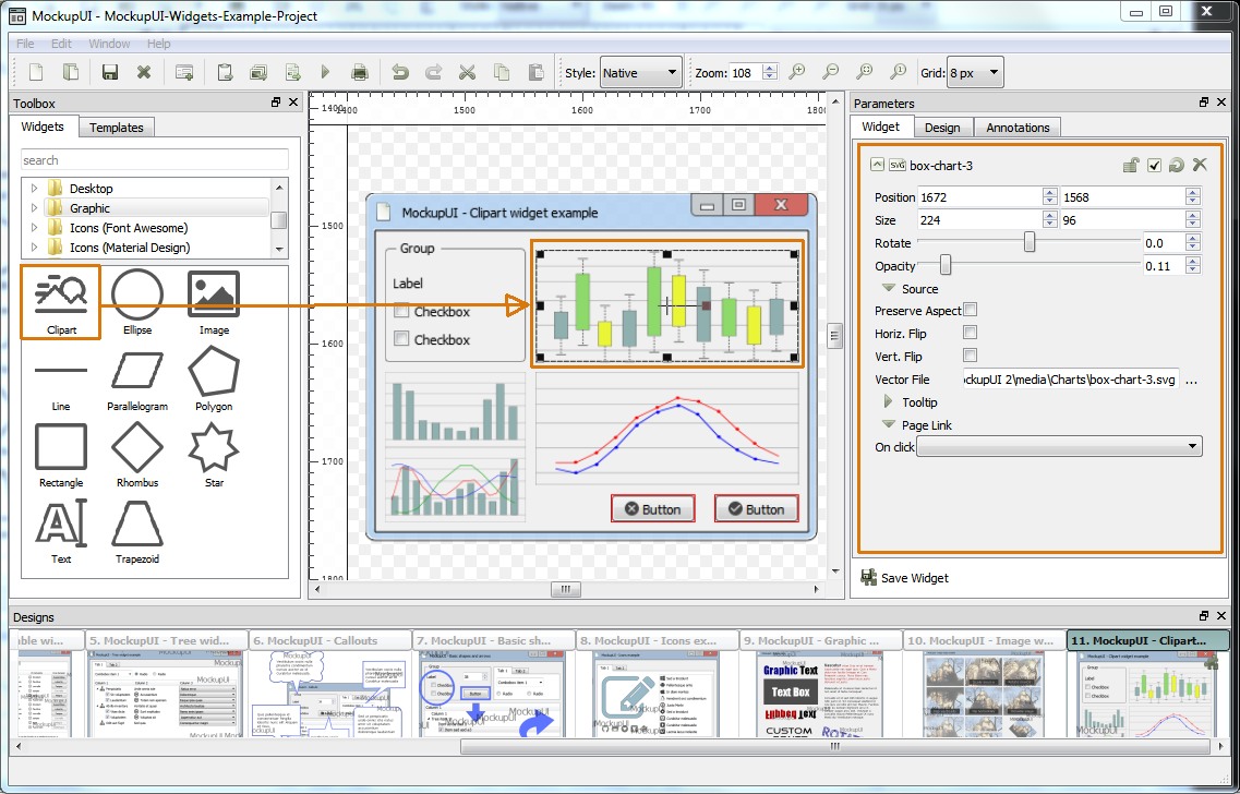
Clipart widget
Draws an SVG file on the current canvas. As for any widget, a vector file can be viewed and edited inside the design area or using the parameter editor in the Widget section.
Features
Clipart scale, flip, rotate and change opacity.
Stretch to widget size or preserve aspect ratio.
Supported file format: SVG.
Widget transformations
Position: The position of the widget in pixels, relative to the canvas and the center of the widget.
Size: The widget's dimensions in pixels or percentage of the canvas dimensions.
Rotate: The angle of rotation around its center.
Opacity: Opacity of the widget from 0 to 100%.
Clipart properties
Preserve aspect ratio: Preserve width to height ratio.
Vert. Flip: Flip the vector image vertically.
Horiz. Flip: Flip the vector image horizontally.
Vector File: The file path to the input SVG file.
The source SVG file can be changed any time during editing while preserving the other parameters. This comes in handy when working with templates.
MockupUI does not embed vector files into the project file, it only keeps file paths from which the vectors are loaded as needed. Make sure you don't move or delete your source vector files from the directory where they were located when inserted.
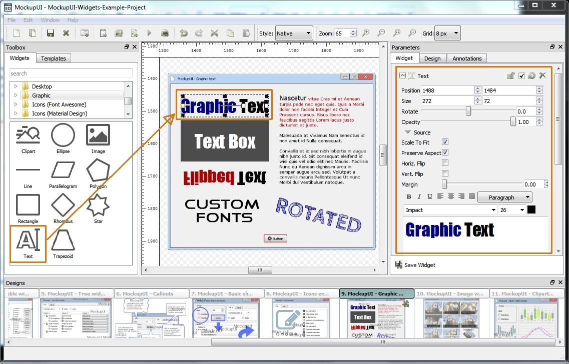
Graphic text widget
Add formatted graphic text to your designs.
Features
Bold, italic, underline.
Select font, size and color.
Align left, right, center or justified.
Rotate text and set margins.
Preserve font dimensions ratio or stretch to size
Paste text from other sources.
Automatically wrap words.
Change the opacity of the text.
Widget transformations
Position: The position of the text widget in pixels, relative to the canvas and the center of the widget.
Size: The widget's dimensions in pixels or percentage of the canvas dimensions.
Rotate: The angle of rotation around its center.
Opacity: Opacity of the widget from 0 to 100%.
Text properties
Scale to Fit: Automatically scales the text up or down in order to fit inside the widget's bounding box.
Preserve aspect ratio: Preserve width to height font ratio.
Vert. Flip: Flip the text vertically.
Horiz. Flip: Flip the text horizontally.
Margin: Add spacing between text and the widget's bounding box.
Text: Specifies the text to draw. The text can be formatted using the text editor toolbar buttons (bold, italic, underline, align left, align right, align center, align justified, font, size and color).
Background
Transparent: No background.
Solid Color: Solid color background.
Gradient: Background with a linear or radial two color gradient.
Pattern: Background filled with predefined pattern (square dots, round dots, horizontal lines, vertical lines, cross lines, diagonal left, diagonal right, diagonal cross) or with a custom shape pattern from a file.
Texture: Fill text background with a texture loaded from an image file. The texture image can be painted as tiles or resized to fit/stretch to the text widget's dimensions.
When Scale To Fit is checked the text will be scaled to fit exactly into the widgets bounding box. Font size is ignored.
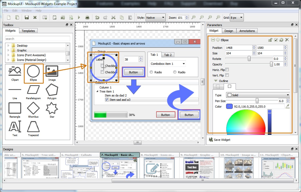
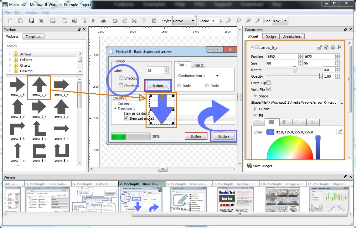
Shape widgets
Insert vector shapes into a design. The available shapes can be found under the Shapes tab in the toolbox.
Basic shapes:
Draw rectangles, lines, ellipses, polygons, stars and more.
Arrows:
Draw arrows of various shapes
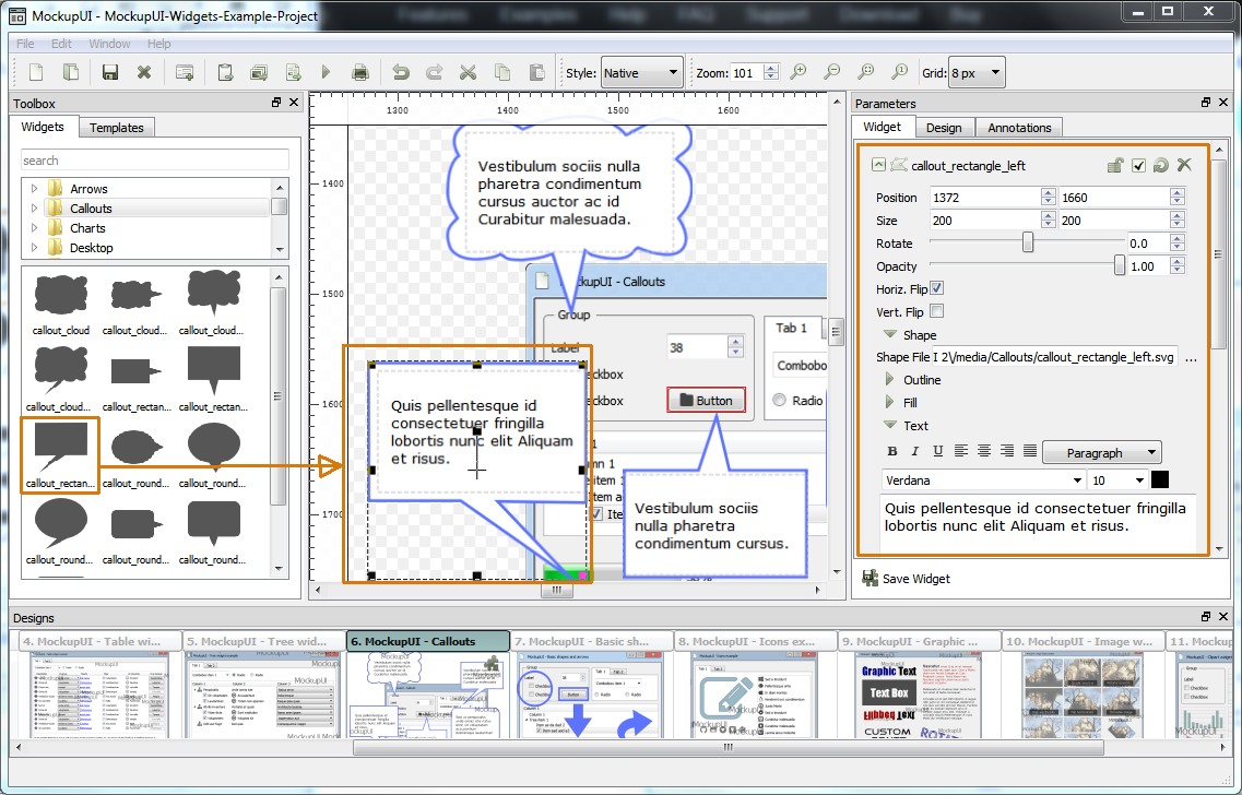
Callouts:
Draw bubbles with text
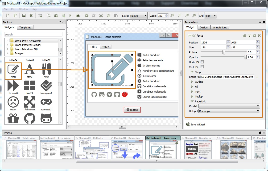
Icons:
Insert customizable icons from the most known icon libraries (Font Awesome, Google Material Design, Windows 10 flat design).
Shape features
Change outline width, color and pattern
Fill shapes with solid colors, gradients, patterns or tiles
Add text to the center of shapes
Make icons clickable and link them to pages for interactive prototypes
Shape transformations
Position: The position of the shape in pixels, relative to the canvas and the center of the widget.
Size: The shape's dimensions in pixels or percentage of the canvas dimensions.
Rotate: The angle of rotation around its center.
Opacity: Global opacity of the shape from 0 to 100%.
Flip: Flip shapes horizontally and vertically
Shape outline
Type: Solid (continuous line), dash, dot.
Pen Size: Thickness of the outline.
Color: Color of the shape's outline.
Opacity: Opacity of the shape's outline from 0 to 100%.
Shape filling
Transparent: No fill.
Solid Color: Fill with a color and an opacity.
Gradient: Fill shape with a linear or radial two color gradient.
Pattern: Fill with a predefined pattern (square dots, round dots, horizontal lines, vertical lines, cross lines, diagonal left, diagonal right, diagonal cross) or with a custom shape pattern from a file.
Texture: Fill shape with a texture loaded from an image file. The texture image can be painted as tiles or resized to fit/stretch to the shape's dimensions.