MockupUI Reference Manual
Contents
User interface
UI widgets
Graphic widgets
Working with widgets
Annotations
Visual styles
Templates
Exporting
Projects
Setup
Help
Working with widgets
In this section you will find out how to:
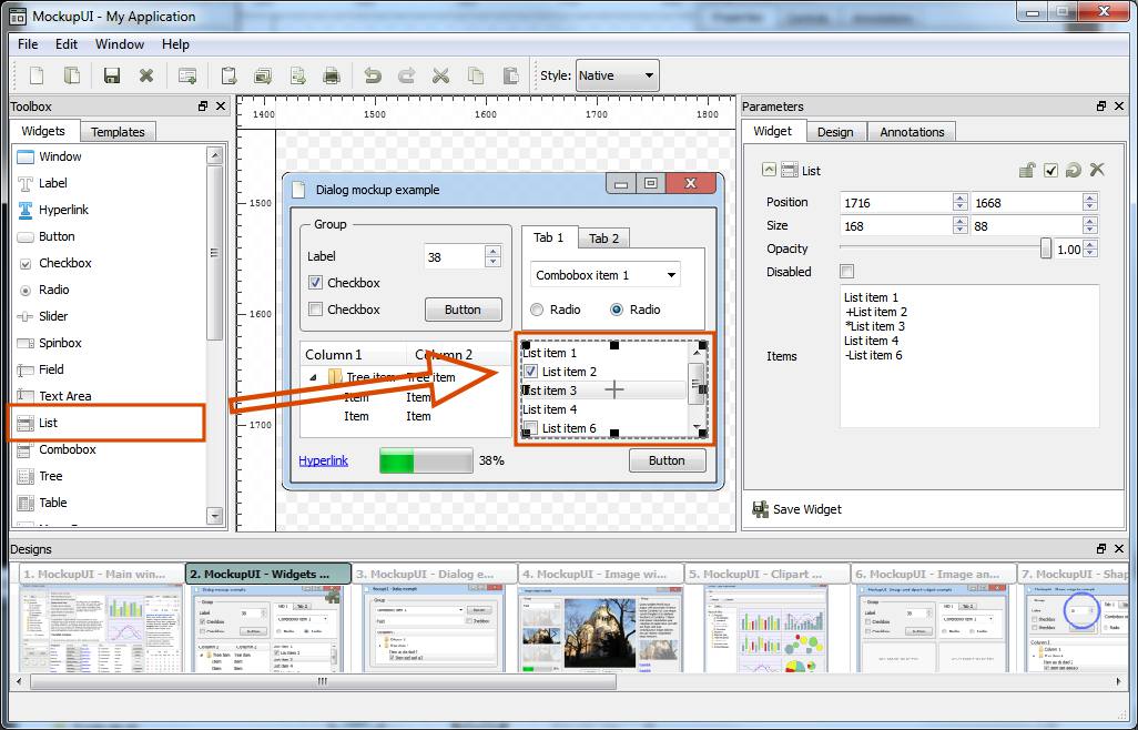
Adding widgets
To insert a widget into a design, drag it from the widgets toolbox and drop it onto the design area where you can change its position and size. You can add content or customize a widget from the parameters panel.
Widget geometry
Widgets can be moved or resized to the desired dimensions inside the design area or from the Widget properties tab.
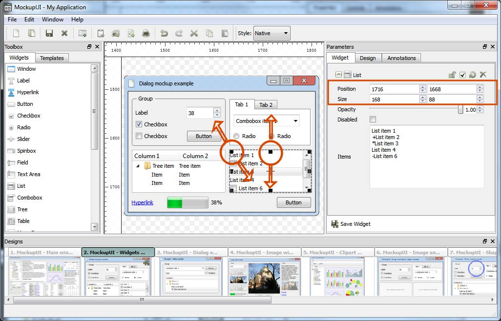
Selecting. Press the
Mouse Left Buttoninside the widget's bounding box to select it. A selected widget will display a rectangular box around it.Moving. Hold the
Mouse Left Buttoninside the widget and move it to the desired position. The position of a widget is relative to center of the widget and to the top-left corner of the canvas. You can use the horizontal and vertical ruler as a guide.Resizing. Hold
Mouse Left Buttonpressed over a corner or a border of the widget and drag it to resize it.
When the mouse hovers over the borders or the corners of a widget, you will notice that the mouse pointer changes into an arrow. This tells you that a resize action is available.
Dragging a border will resize one dimension of the widget while dragging the corner will change the height and width of the widget.
If you wish to preserve the current aspect ratio of the widget, hold the Ctrl key while
dragging.
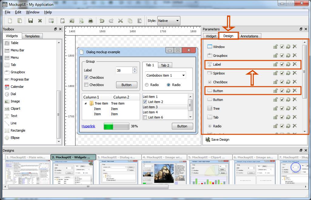
Widget properties
Refer to the GUI widgets and Graphic widgets sections for a complete list of properties that are specific to each type of widget.
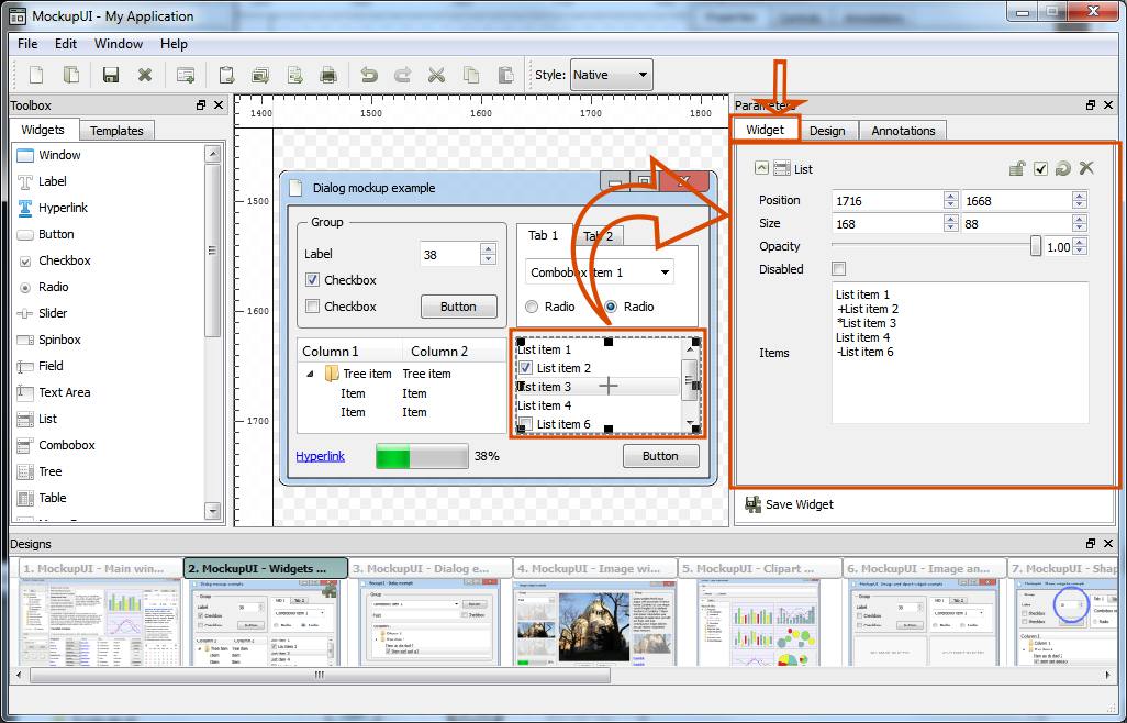
Parameters
Position: Sets the position of the widget's center in pixels.
Size: Sets the widget's dimensions in pixels.
Rotate: Rotates the widget around its center. (Available for graphic widgets only)
Opacity: Changes the opacity of the widget from 0 to 100%.
Disabled: Renders the widget as disabled.
Tooltip: When generating an interactive presentation, the tooltip will appear when the mouse pointer is moved over the widget.
Page Link: Allows you to link the current widget to another design of the current project. When generating an interactive presentation, the widget will become clickable and will allow you to navigate through the pages of the document.