MockupUI Reference Manual
Contents
User interface
UI widgets
Graphic widgets
Working with widgets
Annotations
Visual styles
Templates
Exporting
Projects
Setup
Help
Contents
About the manual
This is the MockupUI Reference Manual. It describes the features found in the application and helps you find information about a tool. This reference manual contains examples that illustrate the usage of MockupUI.
The manual is divided in several sections, each focusing on a different part of MockupUI. Clicking on a section heading will display its contents.
User interface
An overview of the MockupUI user interface (menus, shortcuts, viewers and editors).
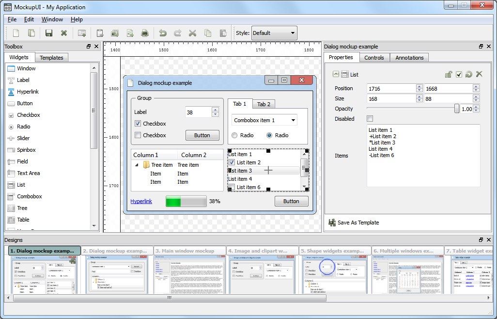
Menu and toolbar. This section describes the actions available in the MockupUI's menu and toolbar.
Design browser. The design browser is where you can browse and select the designs in your project.
Design area. This is where you can visualize and edit a design. It allows you to visually insert, move and resize widgets.
Toolbox panel. An overview of the available widget types in MockupUI and how to use them to create mockups.
Parameters panel. The parameters panel is where you adjust the properties of the widgets and manage their order. The parameters panel has two tabs: Widget and Design.
Keys and mouse reference. This section describes the keyboard and mouse shortcuts of MockupUI.
UI widgets
This section lists the available desktop UI widgets ranging from basic buttons and labels to tables, trees and graphic widgets.
Common widgets
|
|
Table widget
Draws a UI table widget. Find out how to
Populate tables with data in a CSV format.
Add buttons, comboboxes, checkboxes, icons and hyperlinks to cells or entire columns.
Highlight or disable individual table cells.
Tree widget
Design simple trees or multi column tree tables.
Add content to trees and tree tables by simply indenting CSV lines.
Easily add buttons, comboboxes, checkboxes, icons and hyperlinks to items or columns.
Tick/untick cell checkboxes individually.
Highlight or disable individual tree items.
Graphic widgets
Image widget. Insert images into your mockup designs. You can scale, fit, stretch, flip, rotate and change image opacity.
Clipart widget. Add SVG clipart files to your designs. Scale, flip, rotate and change opacity, stretch to widget size or preserve aspect ratio.
Text widget. Add graphic text to your designs. Format text as bold, italic, underline, select font, size and color, align, rotate, set margins, stretch, word wrap and change text opacity.
Shapes. Draw lines, rectangles or ellipse shapes. Select outline width, color and pattern. Fill shapes with solid colors, gradients, patterns or tiles.
Working with widgets
In this section you will find out how to:
Add widgets to a design. Learn how to select a widget type from the toolbox and insert it into a design.
Adjust widget geometry. Explains how to adjust widget dimensions and position using the mouse or in the properties panel.
Change widget properties. Find out how to display widgets as disabled and how to change opacity, show/hide, lock or reset to default.
Re-order widgets. Explains how to re-order widgets in the Design panel.
Annotations
Add descriptions and notes to designs and generate complete specification documents.
Adding notes. Find out how to add descriptions and notes to designs.
Formatting notes. Learn how to format text notes as bold, italic, underline, fonts, size and color, how align paragraphs and create bulleted lists.
Exporting notes. Describes how to generate and preview documents from your designs and notes.
Visual styles
Change the visual appearance of widgets.
Selecting a style: switch from one style to another in one click.
Native styles: native operating system looks (Your current OS, Vista, XP or Classic).
Wireframe style: low fidelity black and white style.
Dark style: style with a dark background and grey contours.
Templates
Save designs as templates and use them to create new designs.
Creating templates. Create your own design templates by saving a design to the template library.
Using templates. Create a new design from a template.
Sharing templates. Import and export templates from your project.
Exporting
Describes how to export designs from MockupUI.
Copy to clipboard. Copy a design to the clipboard and paste it to Word, PowerPoint or other documents.
Exporting screenshots. Export mockup designs as to individual image files.
Exporting documentation. Export designs and annotations to a HTML, PDF or Word document.
Export presentations. Export designs to a clickable presentation package.
Printing. Describes how to print mockup designs from MockupUI.
Project files
This section describes how to create new projects and how to save/load designs from MockupUI .mui project files.
Setup
Installing MockupUI. This section describes how to download and install the MIRAFX MockupUI package.
Purchasing MockupUI. Learn how to buy a license for MockupUI.
Activating MockupUI. Learn how to activate your copy of MockupUI.
More help
Find out how to access this reference manual from MockupUI and how to get more help with the product.