MockupUI Reference Manual
Contents
User interface
UI widgets
Graphic widgets
Working with widgets
Annotations
Visual styles
Templates
Exporting
Projects
Setup
Help
User interface
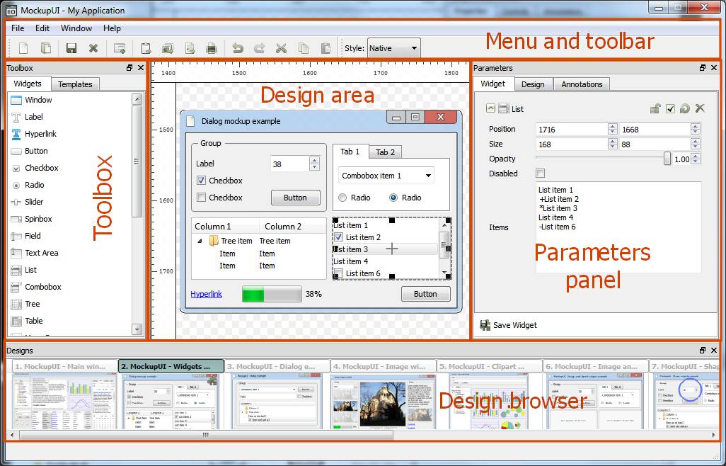
The MockupUI user interface is composed of five main sections:
The Menu and toolbar which allows you to create, open and save a MockupUI project or to export or print designs.
The Toobox panel contains the MockupUI's mockup designing tools:
Widgets: The available UI and graphic widgets that you can use to create mockups.
Templates: The designs or customized widgets that you saved as templates.
The Design area you can preview the currently selected screen. It is also where you can visually insert and edit widgets.
The Parameters is where you adjust the properties of the widgets, manage their order and annotate designs.
Widget: The Widget tab shows the parameter editor of the currently selected widget and it allows you to change the widget's geometry, content and formatting.
Design: The Design tab allows you to hide, lock, reset or remove a widget and to manage the order of the widgets.
Annotations: The annotations tab allows you to add descriptions and notes to your designs.
The Design browser is where you browse and select the design that you want to work on.